
| 일 | 월 | 화 | 수 | 목 | 금 | 토 |
|---|---|---|---|---|---|---|
| 1 | 2 | 3 | 4 | 5 | 6 | 7 |
| 8 | 9 | 10 | 11 | 12 | 13 | 14 |
| 15 | 16 | 17 | 18 | 19 | 20 | 21 |
| 22 | 23 | 24 | 25 | 26 | 27 | 28 |
Tags
- nico
- javascript
- vscode
- ruby
- springboot
- rails7
- 연습문제
- 건담베이스
- rails
- 자바
- 一日一つメソッド
- 건담
- 日本語
- Spring
- Python
- 일본어
- 인프런
- C로 시작하는 컴퓨터 프로그래밍4판
- CSS
- 디지몬
- jsp
- html
- Flutter
- DART
- 単語
- 비즈니스일본어
- 반다이몰
- Web
- メソッド
- java
Archives
- Today
- Total
AR삽질러
유수봉 교수의 WEB-13주차 본문
728x90
Lab_Web_CSS_02 (CSS 고급활용)
유수봉 교수의 Web (CSS 고급활용)
▶ CSS0501.html - 인라인, 블록
<!DOCTYPE html>
<html>
<head>
<title>display 프로퍼티</title>
<style>
div {
border: 2px solid yellowgreen;
color: blue;
background: aliceblue;
}
span {
border: 3px dotted red;
background: yellow;
}
</style>
</head>
<body>
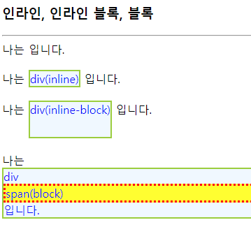
<h3>인라인, 인라인 블록, 블록</h3>
<hr>
나는 <div style="display:none"> div(none)</div>입니다.<br><br>
나는 <div style="display:inline"> div(inline)</div> 입니다.<br><br>
나는 <div style="display:inline-block; height:50px"> div(inline-block)</div> 입니다.<br><br>
나는 <div>div<span style="display:block"> span(block)</span> 입니다. </div>
</body>
</html>
▶ CSS0502.html - 상대배치

<!DOCTYPE html>
<html>

<head>
    <title>relative 배치</title>
    <style>
        div {
            display: inline-block;
            height: 50px;
            width: 50px;
            border: 1px solid lightgray;
            text-align: center;
            color: white;
            background: red;
        }

        #down:hover {
            position: relative;
            left: 20px;
            top: 20px;
            background: green;
        }

        #up:hover {
            position: relative;
            right: 20px;
            bottom: 20px;
            background: green;
        }
    </style>
</head>

<body>
    <h3>상대 배치, relative</h3>
    <hr>
    <div>T</div>
    <div id="down">h</div>
    <div>a</div>
    <div>n</div>
    <div id="up">k</div>
    <div>s</div>
</body>

</html>
▶ CSS0503.html - 절대배치
<!DOCTYPE html>
<html>
<head>
<title>절대 배치</title>
<style>
div {
display: inline-block;
position: absolute;
/* 절대 배치 */
border: 1px solid lightgray;
}
div>p {
display: inline-block;
/* div의 자식 p */
position: absolute;
/* 절대 배치 */
height: 20px;
width: 15px;
background: lightgray;
}
</style>
</head>
<body>
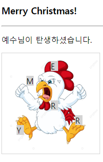
<h3>Merry Christmas!</h3>
<hr>
<p>예수님이 탄생하셨습니다.</p>
<div>
<img src="../../img/chi.png" width="200" height="200" alt="크리스마스 트리">
<p style="left:50px; top:30px">M</p>
<p style="left:100px; top:0px">E</p>
<p style="left:100px; top:80px">R</p>
<p style="left:150px; top:110px">R</p>
<p style="left:30px; top:130px">Y</p>
</div>
</body>
</html>
▶ CSS0506.html - z-index
<!DOCTYPE html>
<html>
<head>
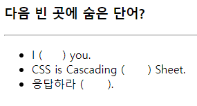
<title>visibility 프로퍼티</title>
<style>
span {
visibility: hidden;
}
</style>
</head>
<body>
<h3>다음 빈 곳에 숨은 단어?</h3>
<hr>
<ul>
<li>I (<span>love</span>) you.
<li>CSS is Cascading (<span>Style</span>) Sheet.
<li>응답하라 (<span>1988</span>).
</ul>
</body>
</html>
▶ CSS0508.html - overflow
<!DOCTYPE html>
<html>
<head>
<title>overflow 프로퍼티</title>
<style>
p {
width: 15em;
height: 3em;
border: 1px solid lightgray;
}
.hidden {
overflow: hidden;
}
.visible {
overflow: visible;
}
.scroll {
overflow: scroll;
}
</style>
</head>
<body>
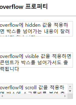
<h3>overflow 프로퍼티</h3>
<hr>
<p class="hidden">overflow에 hidden 값을 적용하면 박스를 넘어가는 내용이 잘려 보이지 않습니다.</p><br>
<p class="visible">overflow에 visible 값을 적용하면 콘텐트가 박스를 넘어가서도 출력됩니다</p><br>
<p class="scroll">overflow에 scroll 값을 적용하면 박스에 스크롤바를 붙여 출력합니다.</p>
</body>
</html>
▶ CSS0509.html - Menu Bar
<!DOCTYPE html>
<html>
<head>
<title>리스트로 메뉴 만들기</title>
<style>
#menubar {
background: olive;
}
#menubar ul {
margin: 0;
padding: 0;
/* 여백과 패딩 모두 0 */
width: 567px;
/* 모든 아이템(<li>)을 한 줄에 품을 수 있는 폭 */
}
#menubar ul li {
display: inline;
/* 새 줄로 넘어가지 않게 */
list-style-type: none;
/* 마커 삭제 */
padding: 0px 15px;
/* top=bottom=0, left=right=15px */
}
#menubar ul li a {
color: white;
text-decoration: none;
/* 링크 보이지 않게 */
}
#menubar ul li a:hover {
color: violet;
/* 마우스 올라 갈 때 색 */
}
</style>
</head>
<body>
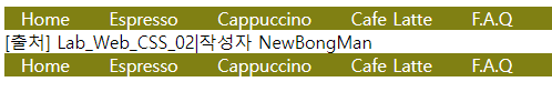
<nav id="menubar">
<ul>
<li><a href="#">Home</a></li>
<li><a href="#">Espresso</a></li>
<li><a href="#">Cappuccino</a></li>
<li><a href="#">Cafe Latte</a></li>
<li><a href="#">F.A.Q</a></li>
</ul>
</nav>
</body>
</html>
▶ CSS0510.html - Table
<!DOCTYPE html>
<html>
<head>
<title>표 응용 1</title>
<style>
table {
border-collapse: collapse;
}
/* 이중 테두리 제거 */
td,
th {
text-align: left;
padding: 5px;
height: 15px;
width: 100px;
}
/* 모든 셀에 적용 */
thead,
tfoot {
background: darkgray;
color: yellow;
}
/* <thead>의 모든 셀에 적용 */
tbody tr:nth-child(even) {
ackground: aliceblue;
}
/* 짝수 <tr>에 적용*/
tbody tr:hover {
background: pink;
}
</style>
</head>
<body>
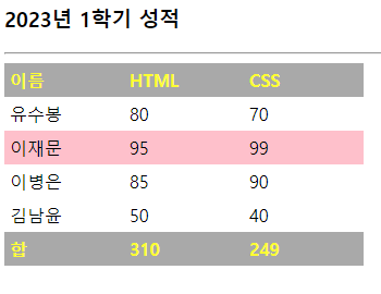
<h3>2023년 1학기 성적</h3>
<hr>
<table>
<thead>
<tr>
<th>이름</th>
<th>HTML</th>
<th>CSS</th>
</tr>
</thead>
<tfoot>
<tr>
<th>합</th>
<th>310</th>
<th>249</th>
</tr>
</tfoot>
<tbody>
<tr>
<td>유수봉</td>
<td>80</td>
<td>70</td>
</tr>
<tr>
<td>이재문</td>
<td>95</td>
<td>99</td>
</tr>
<tr>
<td>이병은</td>
<td>85</td>
<td>90</td>
</tr>
<tr>
<td>김남윤</td>
<td>50</td>
<td>40</td>
</tr>
</tbody>
</table>
</body>
</html>쌤쌤마트
Lab_Web_CSS_03(CSS 고급활용)
▶ CSS0511.html - Form
<!DOCTYPE html>
<html>
<head>
<title>폼 스타일 주기</title>
<style>
input[type=text] {
/* text 창에만 적용 */
color: red;
}
input:hover,
textarea:hover {
/* 마우스 올라 올 때 */
background: aliceblue;
}
input[type=text]:focus,
input[type=email]:focus {
/* 포커스 받을 때 */
font-size: 120%;
}
label {
display: block;
/* 새 라인에서 시작 */
padding: 10px;
}
label span {
float: left;
width: 90px;
text-align: right;
padding: 10px;
}
</style>
</head>
<body>
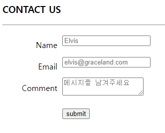
<h3>CONTACT US</h3>
<hr>
<form>
<label>
<span>Name</span><input type="text" placeholder="Elvis"><br>
</label>
<label>
<span>Email</span><input type="email" placeholder="elvis@graceland.com">
</label>
<label>
<span>Comment</span><textarea placeholder="메시지를 남겨주세요"></textarea>
</label>
<label>
<span></span><input type="submit" value="submit">
</label>
</form>
</body>
</html>
▶ CSS0512.html - Animation
<!DOCTYPE html>
<html>
<head>
<title>애니메이션</title>
<style>
@keyframes bomb {
from {
font-size: 500%;
}
to {
font-size: 100%;
}
}
h3 {
animation-name: bomb;
animation-duration: 3s;
animation-iteration-count: infinite;
}
</style>
</head>
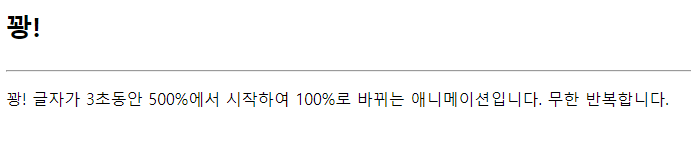
<body>
<h3>꽝!</h3>
<hr>
<p>꽝! 글자가 3초동안 500%에서 시작하여
100%로 바뀌는 애니메이션입니다.
무한 반복합니다.</p>
</body>
</html>
▶ CSS0514.html - Transform

<!DOCTYPE html>
<html>

<head>
    <title>다양한 변환 사례</title>
    <style>
        div {
            display: inline-block;
            padding: 5px;
            color: white;
            background: olivedrab;
        }

        /* 변환 */
        div#rotate {
            transform: rotate(20deg);
        }

        div#skew {
            transform: skew(0deg, -20deg);
        }

        div#translate {
            transform: translateY(100px);
        }

        div#scale {
            transform: scale(3, 1);
        }

        /* 마우스 올릴 때 추가 변환 */
        div#rotate:hover {
            transform: rotate(80deg);
        }

        div#skew:hover {
            transform: skew(0deg, -60deg);
        }

        div#translate:hover {
            transform: translate(50px, 100px);
        }

        div#scale:hover {
            transform: scale(4, 2);
        }

        /* 마우스 누를 때 추가 변환 */
        div#scale:active {
            transform: scale(1, 5);
        }
    </style>
</head>

<body>
    <h3>다양한 Transform</h3>
    아래는 회전(rotate), 기울임(skew), 이동(translate), 확대/축소(scale)가 적용된 사례이다. 또한 마우스를 올리면 추가적 변환이 일어난다.
    <hr>
    <div id="rotate">rotate 20 deg</div>
    <div id="skew">skew(0,-20deg)</div>
    <div id="translate">translateY(100px)</div>
    <div id="scale">scale(3,1)</div>
</body>

</html>
728x90
반응형
LIST
'WEB > 유수봉교수의 WEB' 카테고리의 다른 글
| 유수봉 교수의 WEB-14주차 - JavaScript (0) | 2023.06.07 |
|---|---|
| 유수봉 교수의 WEB-12주차 (0) | 2023.05.31 |
| 유수봉 교수의 WEB-11주차 (0) | 2023.05.17 |
| 유수봉 교수의 WEB-10주차 (0) | 2023.05.10 |
| 유수봉 교수의 WEB-9주차 (0) | 2023.05.03 |
'WEB/유수봉교수의 WEB' Related Articles
more


